|
|
Post by Sketch Kid on Jul 10, 2010 9:17:05 GMT -5
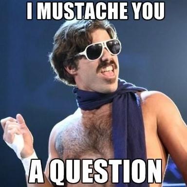
WooT! More to come, I just started using Photoshop CS3 so I got to adjust and get better. Still got to figure out how to do designs in the background but I'll figure it out. Back to youtube! |
|
|
|
Post by Sketch Kid on Jul 10, 2010 11:59:42 GMT -5
I'm just testing the water still. Young Gangsta doesn't have to use it, I just picked him because he's Young Gangsta. I figured out the background and figured out the layers. I'm still figuring out the font but it seems okay to me. Now all I have left is to adjust to it and find new designs and such to make my banners look better each time I produce them. I'm glad to say that I am making quick progress. Credit to Shawn Dreamer and YOUtube. |
|
|
|
Post by Sketch Kid on Jul 10, 2010 13:10:52 GMT -5
I need to figure out how to do the borders but I think that I'm getting everything else okay. Feel free to rate these banners (minus the first one, that one was for fun). I'm just making random banners and MMMII was my other opponent for the match so I figured why not. Yet again, I'm not expecting anybody to use the banners they're just for my improvement but since I'm making them of people who don't have banners then they can take them if they want. |
|
|
|
Post by Sketch Kid on Jul 12, 2010 14:44:11 GMT -5
See how I figured out the border? Anyway, I obviously had to do a banner of Red Dead Redemption because it's the best game of 2010. So, props to Rockstar and John Marston! I'm getting better every time I make a banner. Soon I'll be popping out banners like Octo Mom pops out babies. |
|
|
|
Post by Sketch Kid on Jul 12, 2010 15:02:06 GMT -5
Here's another one, I made it the other day but didn't feel like posting it. But now that I got the border thing figured out I edited it onto this banner and decided to post it since it looks better. |
|
|
|
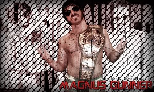
Post by The Rock Messiah ® on Jul 13, 2010 8:52:44 GMT -5
I'll give you some work.
Base: Samoa Joe
Name: Joe
Size: Around the size of the one I have...
Creative Freedom.
Let's see what you can work up Reeves.
|
|
|
|
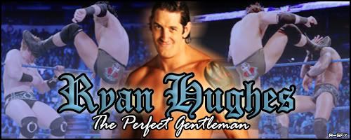
Post by Ryan Hughes on Jul 13, 2010 11:43:38 GMT -5
Yeah, everyone needs practice. And hey, your starting GFX is better than my attempts as a rookie....
Base: Zack Ryder
Name: Ryan Hughes
Sub-text: The Master Mentalist
Size: 400 x 200
Try it with a sky blue theme. Or creative freedom, it's up to you.
|
|
|
|
Post by Sketch Kid on Jul 13, 2010 12:40:19 GMT -5
If you don't like it lemme know and I'll make you another one. I think it's good but the font may be a little iffy. I saved a copy without the font so I can edit it if you don't like how it mixes with the banner. EDIT: I had to add the banner URL. I forgot to put it up earlier. |
|
|
|
Post by Sketch Kid on Jul 13, 2010 13:21:50 GMT -5
Thanks for the compliments, Ryan. I do have some experience from GIMP 2 but if anybody has seen my gfx from there they would know how much they sucked. I like Photoshop better because it's easier to use and less frustrating with the font. I did use the closest color to sky blue for the background but if you don't like anything about the banner let me know and I will redo it. EDIT I fixed the banner up so it would look better in my opinion. You can pick either one, I'll leave it up to you. |
|
|
|
Post by Ryan Hughes on Jul 13, 2010 18:37:40 GMT -5
I like the second one best. Although the font seems a little out of place. Have you tried downloading some from dafont.com? I get all mine there. That, and I would try doing stuff which involves screen caps, or backgrounds, intead of just cutouts. Like the one I have, or the one Oliveira has. Experiment with that, and you'll go far.
Karma for the first attempt, though.
|
|
|
|
Post by Sketch Kid on Jul 14, 2010 2:31:19 GMT -5
Yeah, I was not happy with the font and tried various methods to make it stand out but not too much. I heard of DaFont but I have not tried it with Photoshop, yet. I'll try it out for my next banner but I'm not sure what you mean by screen caps and backgrounds. I think I do, for example a PSD of The Rock hitting Stone Cold w/ Rock Bottom or a PSD of Mr. Anderson talking on the mic. That's what you mean, right?
|
|
|
|
Post by Ryan Hughes on Jul 14, 2010 2:36:31 GMT -5
No, I mean for example the second right pic on my sig. Zack Ryder pinning Yoshi Tatsu. It is a photo, not a PSD. You can see the ring ropes behind him. I sometimes think that this is better than using a background, and makes it seem more creative. But hey, it's a matter of taste, and every designer has different taste.
|
|
|
|
Post by Sketch Kid on Jul 15, 2010 2:33:29 GMT -5
Hm, I'll try it out on a few sample gfx to see if I'm good at using it.
|
|
|
|
Post by wasted on Jul 15, 2010 22:05:20 GMT -5
Can I get sig for Alex Night?
CB: Ashton Kutcher
Text: Alex Night
Sub-Text: Why So Emotional!?
|
|
|
|
Post by Sketch Kid on Jul 16, 2010 12:31:56 GMT -5
I'm not sure if there are PSDs of A.K. but I will try the next time I get on the computer.
|
|